Cart 0
No products in the cart.

Type and hit enter
Combining colors and textures is a true art that can turn an ordinary piece into something exclusive. In this article, you’ll learn how to choose yarn, mix shades, and work with textures to achieve harmony and visual balance in your creations.
Knitting is not only a technique but also an artistic process. When we talk about combining colors in knitting, it’s important to understand the basic principles: contrast, analogy, monochrome, and accent. Each approach creates its own visual effect and mood.
Use the classic color wheel to select harmonious shades. For example, blue and yellow create a vibrant contrast, while pink with purple makes for a delicate analogy.
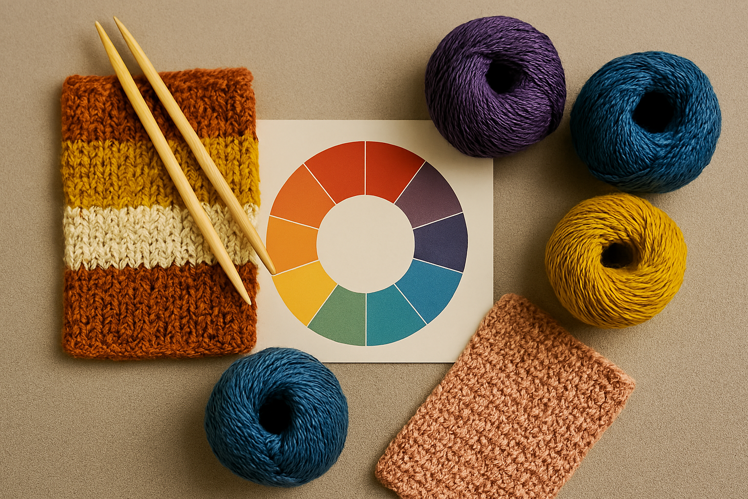
Your main color should take up about 60% of the project, secondary colors around 30%, and only 10% should be bright accents. This proportion helps avoid visual overload.

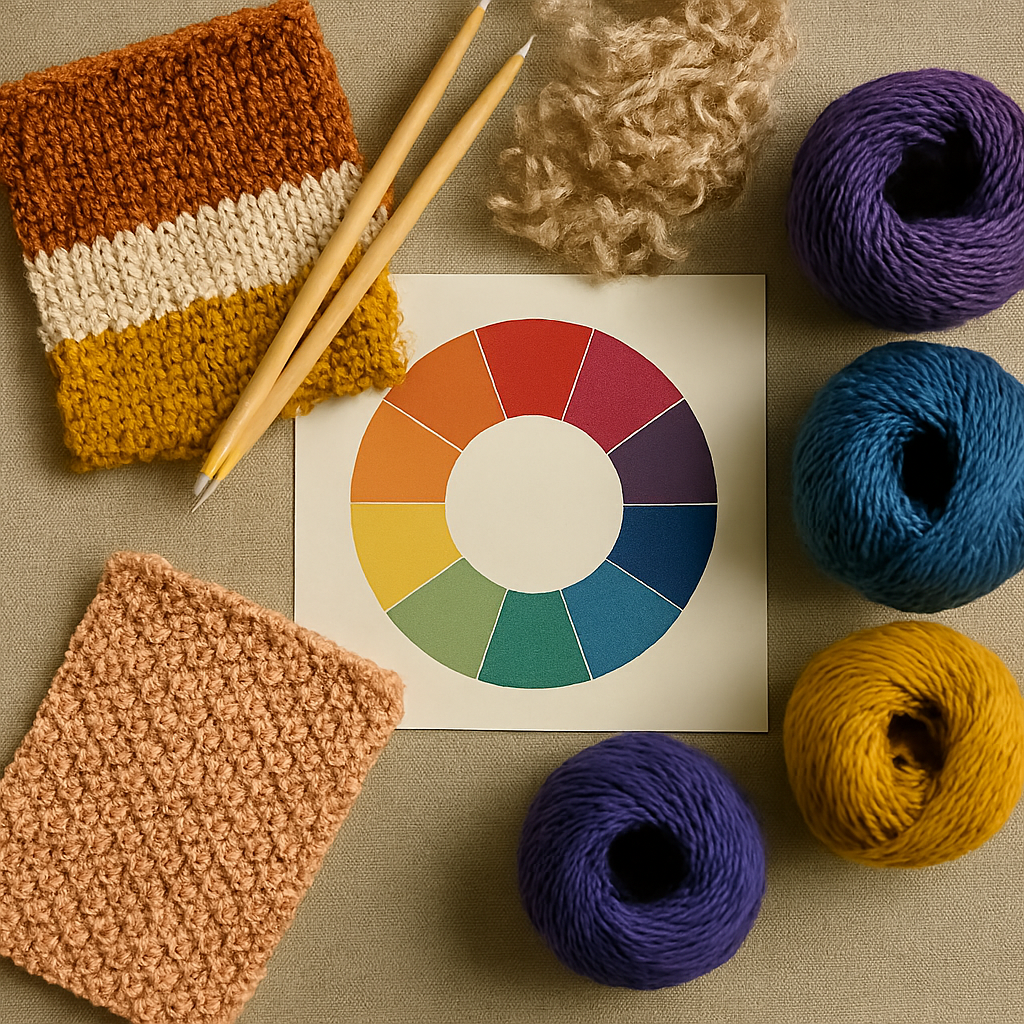
Equally important is working with textures. Mixing smooth and fluffy yarns, or silky and matte finishes, makes the piece more multi-dimensional and interesting.
For example, use smooth cotton as the base and add accents from mohair or boucle. This creates a sense of depth and luxury.

If you’re working with a complex pattern or a rich color palette, it’s better to use a uniform texture to avoid overwhelming the design.
Experiment with colors and textures, always keeping balance in mind. The secret to a true designer masterpiece lies in harmonious combinations.